Statistics
Autocorrelation
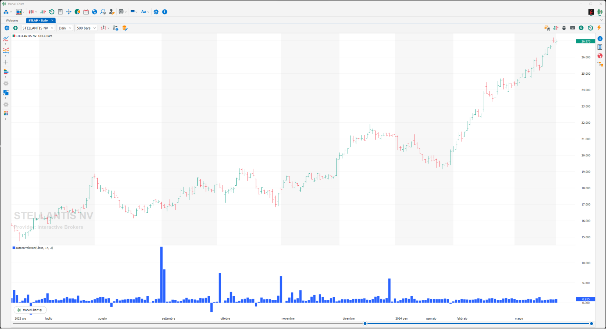
An autocorrelation indicator measures the correlation of a time series with a lagged or shifted version of itself. It helps in identifying patterns and dependencies within a single data series over time, revealing whether past values can predict future values. Essentially, it's a tool for understanding how a variable relates to its own past values at different time intervals.
Correlation vs. Autocorrelation
Correlation measures the relationship between two different variables, while autocorrelation measures the relationship between a single variable and itself at different points in time.
Lagging
Autocorrelation involves comparing a time series to its lagged versions, meaning the series is shifted by a certain number of time periods (the "lag"). For example, a lag of 1 means comparing today's values with yesterday's, a lag of 2 compares today's values with the day before yesterday, and so on.
Interpreting Results
Autocorrelation values range from -1 to +1, similar to correlation. +1 indicates a perfect positive autocorrelation (strong positive relationship between past and future values), -1 indicates a perfect negative autocorrelation (strong negative relationship), and 0 indicates no autocorrelation.
Applications
Autocorrelation is used in various fields, including:
Time series analysis: Identifying patterns, trends, and seasonality in data.
Finance: Analyzing price movements, identifying trends, and predicting future prices.
Signal processing: Detecting patterns in signals like audio or radio waves.
GPS technology: Correcting for signal delays.
Autocorrelation in the context of trading and finance
Autocorrelation can be a valuable tool for traders and analysts.
Identify potential trends
If a stock's price has a positive autocorrelation at a certain lag, it suggests a tendency for prices to continue moving in the same direction.
Identify mean reversion
If there is a negative autocorrelation at a certain lag, it may indicate that prices tend to revert to their average value after a period of deviation.
Develop trading strategies
Autocorrelation analysis can be used to develop strategies based on identifying patterns and potential future price movements.
Chande Forecast Oscillator
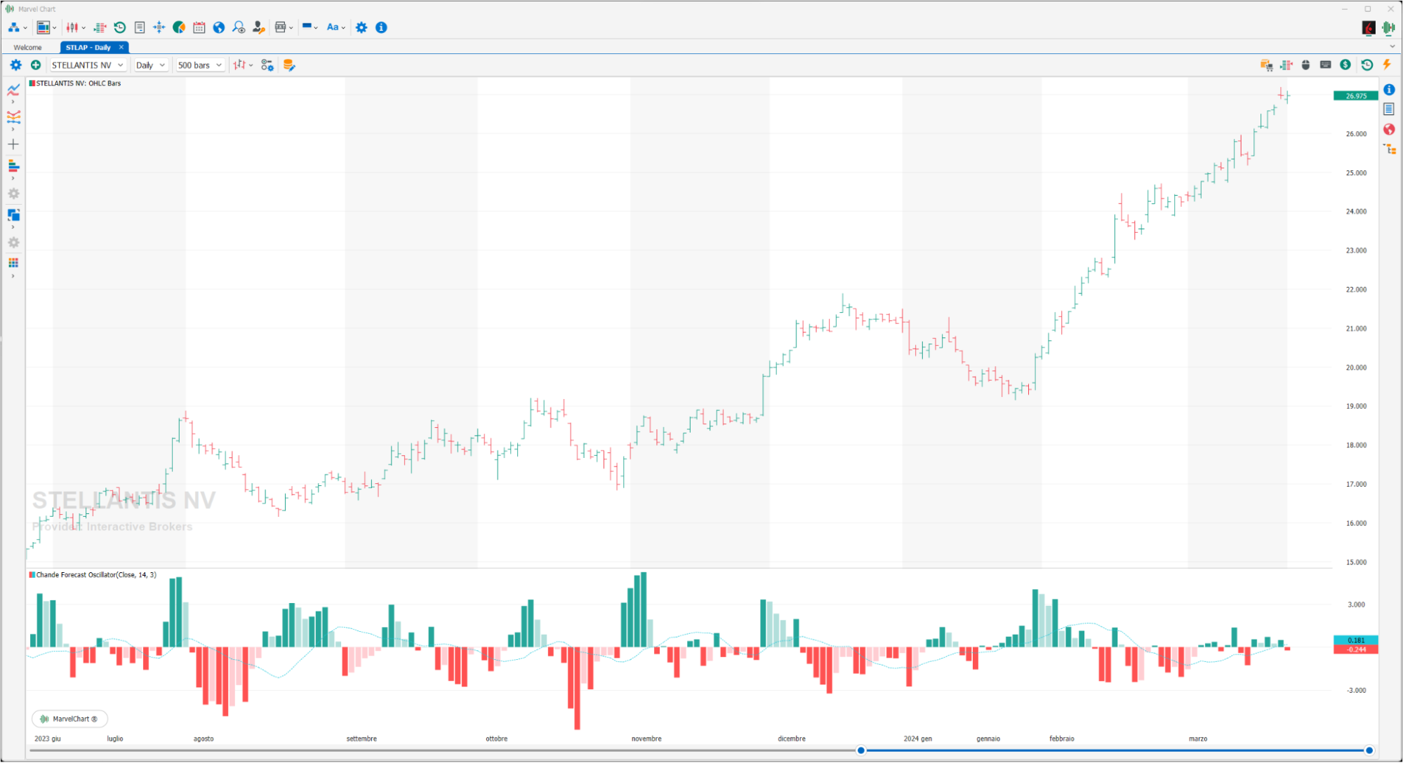
The Chande Forecast Oscillator (CFO) is a technical indicator developed by Tushar Chande that predicts future price movements by comparing the current price of an asset to its forecasted price, calculated using linear regression. It helps identify potential trends and reversal points by oscillating around a zero line, with positive values indicating the current price is above the forecast and negative values indicating it's below.
Key aspects of the Chande Forecast Oscillator
Forecasted Price
The CFO uses a linear regression model to forecast the future price of an asset.
Oscillation
The indicator oscillates around a zero line, with values above zero suggesting the current price is higher than the forecast, and values below zero suggesting it's lower.
Momentum and Reversals
Traders use the CFO to identify potential bullish or bearish momentum based on crossovers of the zero line and divergences between the indicator and price movements.
Overbought/Oversold
The CFO can also be used as an overbought/oversold indicator, with extreme values suggesting potential reversal points.
Confirmation
It can be used to confirm other trading signals, like those from support and resistance levels.
How to use the CFO
Crossovers
A crossover above the zero line can signal bullish momentum, while a crossover below the zero line can indicate bearish momentum.
Divergence
Divergence between the CFO and price action can also be a strong signal. For example, if the price is making higher highs but the CFO is making lower highs, it could indicate weakening bullish momentum.
Overbought/Oversold
Traders may look for extreme values of the CFO (e.g., below -50 for oversold) and wait for a bounce back above the threshold as a buy signal, or vice versa for a sell signal.
Change %
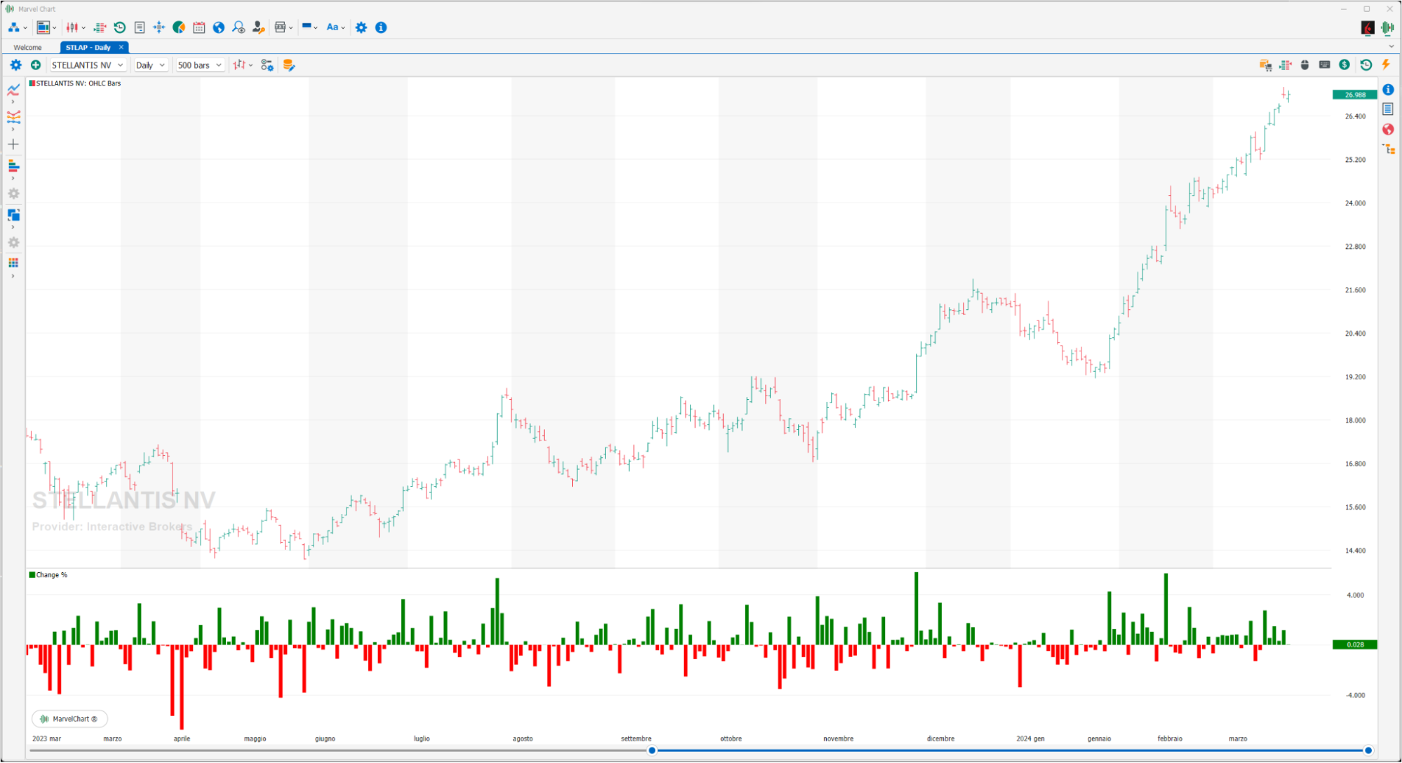
Change % is a simple statistical indicator: it displays the % change of financial instruments compared to the CLOSE of the previous day. It is not influenced by the selected timeframe because it does not take the CLOSE of the previous bar as a reference, but that of the previous day.
Correlation Coefficient
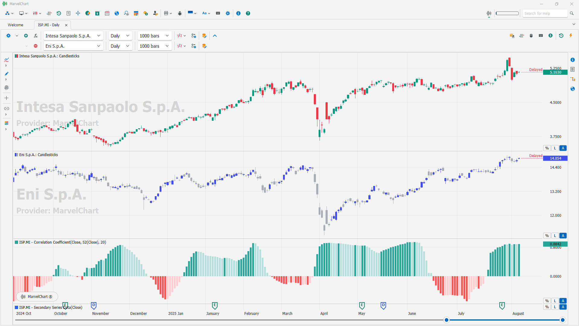
A correlation coefficient indicator is a tool used in finance and statistics to measure the strength and direction of the linear relationship between two variables. It helps traders and investors understand how closely two assets move together or in opposite directions. The correlation coefficient quantifies the extent to which two variables change in relation to each other. It always falls between -1 and +1.
Interpretation
+1: Perfect positive correlation. When one asset's price increases, the other's price increases proportionally. -1: Perfect negative correlation. When one asset's price increases, the other's price decreases proportionally. 0: No correlation. The assets' movements are unrelated.
Values closer to +1 or -1 indicate a stronger relationship, while values closer to 0 indicate a weaker relationship.
How it's used in trading
Diversification
Investors use correlation coefficients to identify assets with low or negative correlations, which can help reduce overall portfolio risk.
Trading strategies
Traders can use correlation to identify potential trading opportunities, such as when two assets that are usually correlated diverge, suggesting a potential arbitrage opportunity.
Trend confirmation
In some cases, correlation can be used to confirm trends, for example, if two related assets are both trending upwards, it may strengthen the conviction in that upward trend.
Example
If the correlation between the price of gold and the US dollar is -0.8, it indicates a strong negative correlation. When the price of gold goes up, the US dollar tends to go down, and vice versa.
Limitations
Linear relationship only
Correlation coefficients primarily measure linear relationships. They may not accurately represent relationships that are non-linear.
Correlation vs. Causation
Correlation does not imply causation. Just because two assets are correlated doesn't mean one causes the other to move.
Time-varying correlation
Correlation between assets can change over time, so it's important to monitor correlation coefficients regularly.
Generic Oscillator
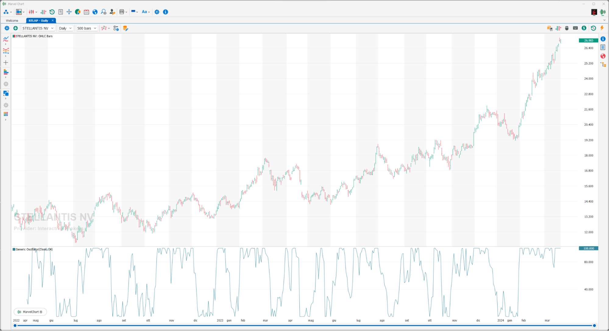
The Generic Oscillator is a function that translates the input price series into an oscillator between 0 and 100, using the LOW and high values in the period to scale and normalize the value of the current price.
Kurtosis
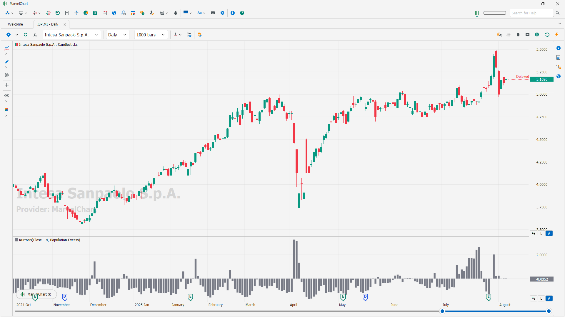
Kurtosis is a statistical measure that describes the "tailedness" of a probability distribution. It indicates whether the distribution is more or less peaked than a normal distribution, and whether it has heavier or lighter tails. A higher kurtosis value suggests heavier tails and more outliers, while a lower kurtosis value suggests lighter tails and fewer outliers. This indicator displays the "Excess Kurtosis".
Tailedness
Kurtosis specifically measures the extent to which a distribution deviates from a normal distribution in terms of its tails.
Normal Distribution
A normal distribution, also known as a Gaussian distribution, has a kurtosis value of 3 (or 0 when using excess kurtosis like in this indicator).
Leptokurtic
Distributions with kurtosis greater than 3 (or excess kurtosis greater than 0 like in this indicator) are called leptokurtic. They have heavier tails and a more pronounced peak than a normal distribution.
Platykurtic
Distributions with kurtosis less than 3 (or excess kurtosis less than 0 like in this indicator) are called platykurtic. They have lighter tails and a flatter peak than a normal distribution.
Mesokurtic
Distributions with kurtosis equal to 3 (or excess kurtosis equal to 0 like in this indicator) are called mesokurtic. They have the same peakedness and tail behavior as a normal distribution.
Summary
Linear Regression Forecast
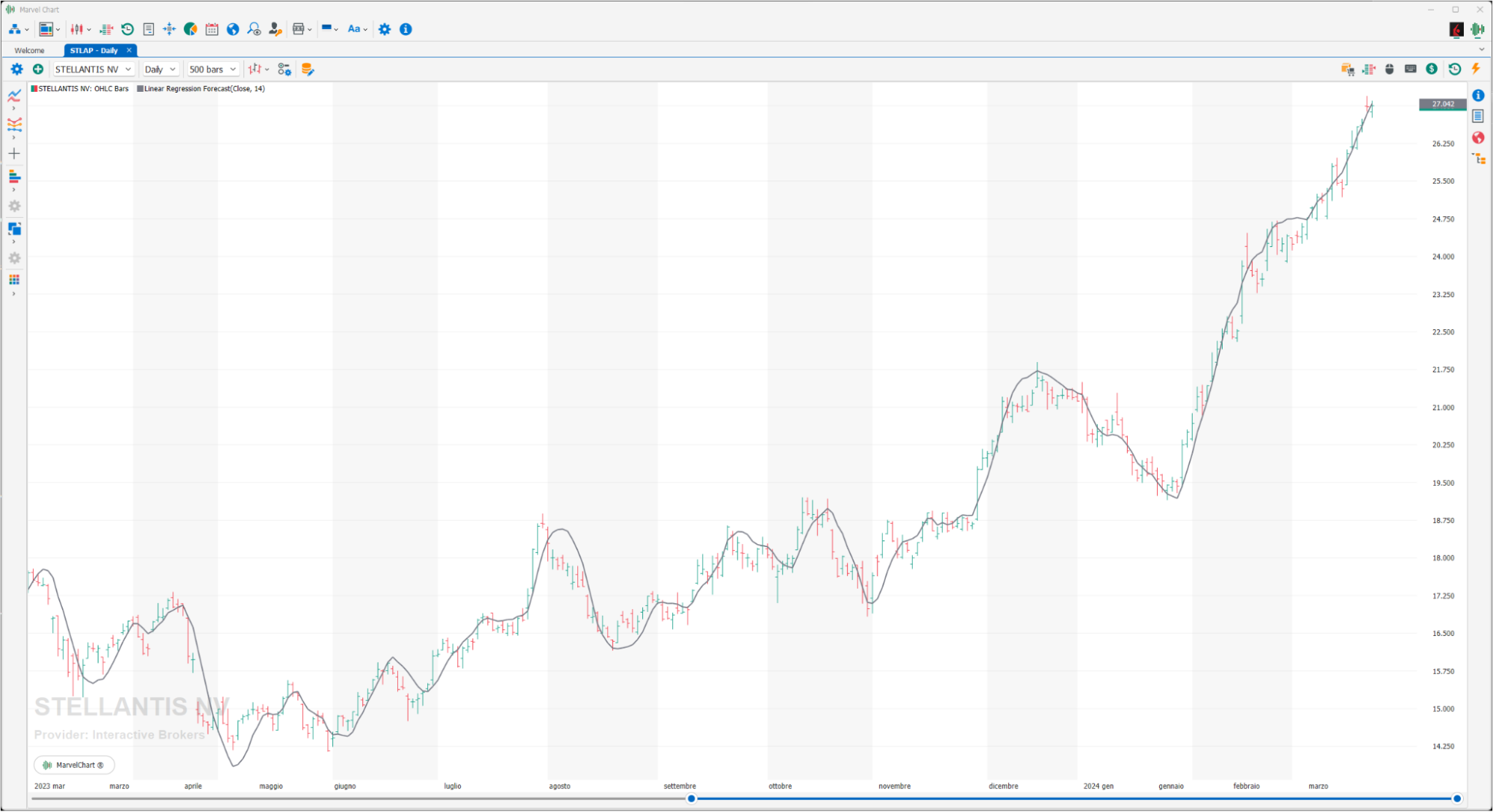
It is the simple linear regression, which is a method of finding the linear equation that best fits a set of data points. Linear regression forecasting tries to pass through multiple points while minimizing the distance between them. The interpretation of the linear regression forecast indicator is similar to the moving average but has the advantage of having a “lag”: since the indicator corresponds to a data line rather than an average, the linear regression forecast is more sensitive to price changes.
Linear Regression Intercept
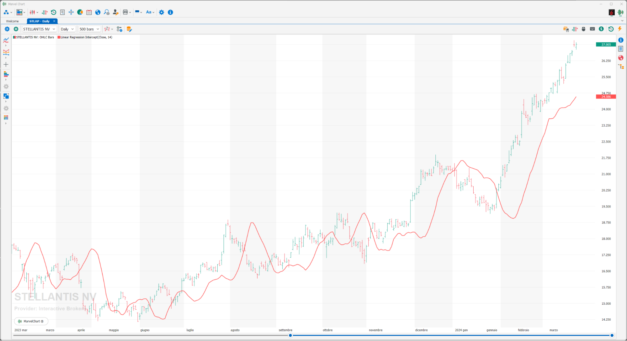
The Linear Regression Intercept is one of the statistical indicators calculated using linear regression, it is in fact calculated using the classic formula of the “Linear Regression Forecast” but assigning the Y value (price axis) assuming the X value (time axis) = 0.
Linear Regression R-Squared
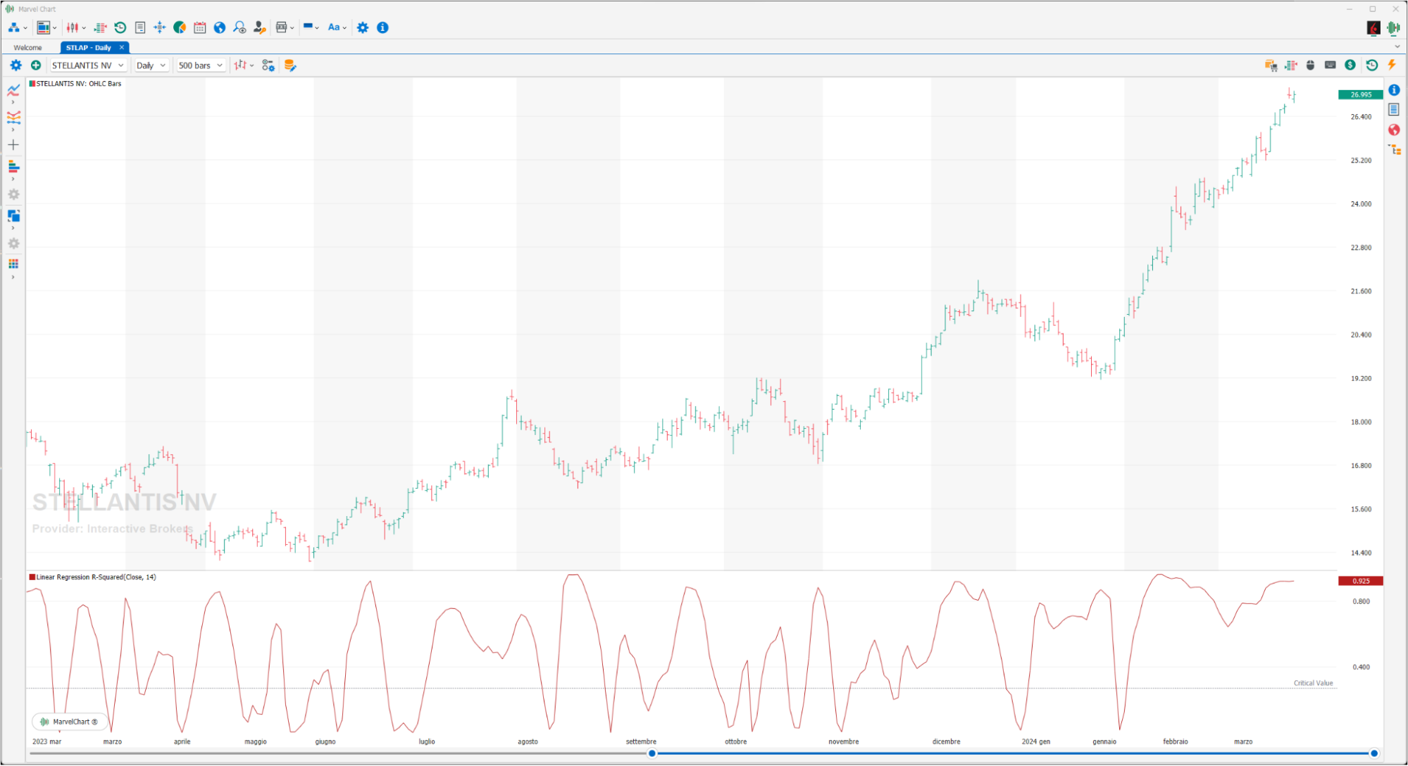
Linear regression is widely used by technical analysts. While the slope of the linear regression line indicates the direction of the market trend, r-squared highlights the strength of the market itself: the closer the prices are to the regression line, the stronger the trend. The value assumed by this variable identifies the percentage of price movement that is indicated by the linear regression, this means that a value equal to 0.3 (calculated over 21 periods) indicates that 30% of the price movement is included in the regression line, while the remaining 70% is not correlated with the linear regression. Low values express a high strength of the trend. To determine if the trend is statistically significant for a linear regression built on "x" periods, refer to the following table that shows the r-squared values required for a 95% confidence level, based on various time periods. If the value assumed by the indicator is lower than that indicated in the table, it must be deduced that prices do not show a statistically significant trend.
Periods | R-Squared value |
|---|---|
5 | 0.77 |
10 | 0.40 |
14 | 0.27 |
20 | 0.20 |
25 | 0.16 |
30 | 0.13 |
50 | 0.08 |
60 | 0.06 |
120 | 0.03 |
Linear Regression Slope
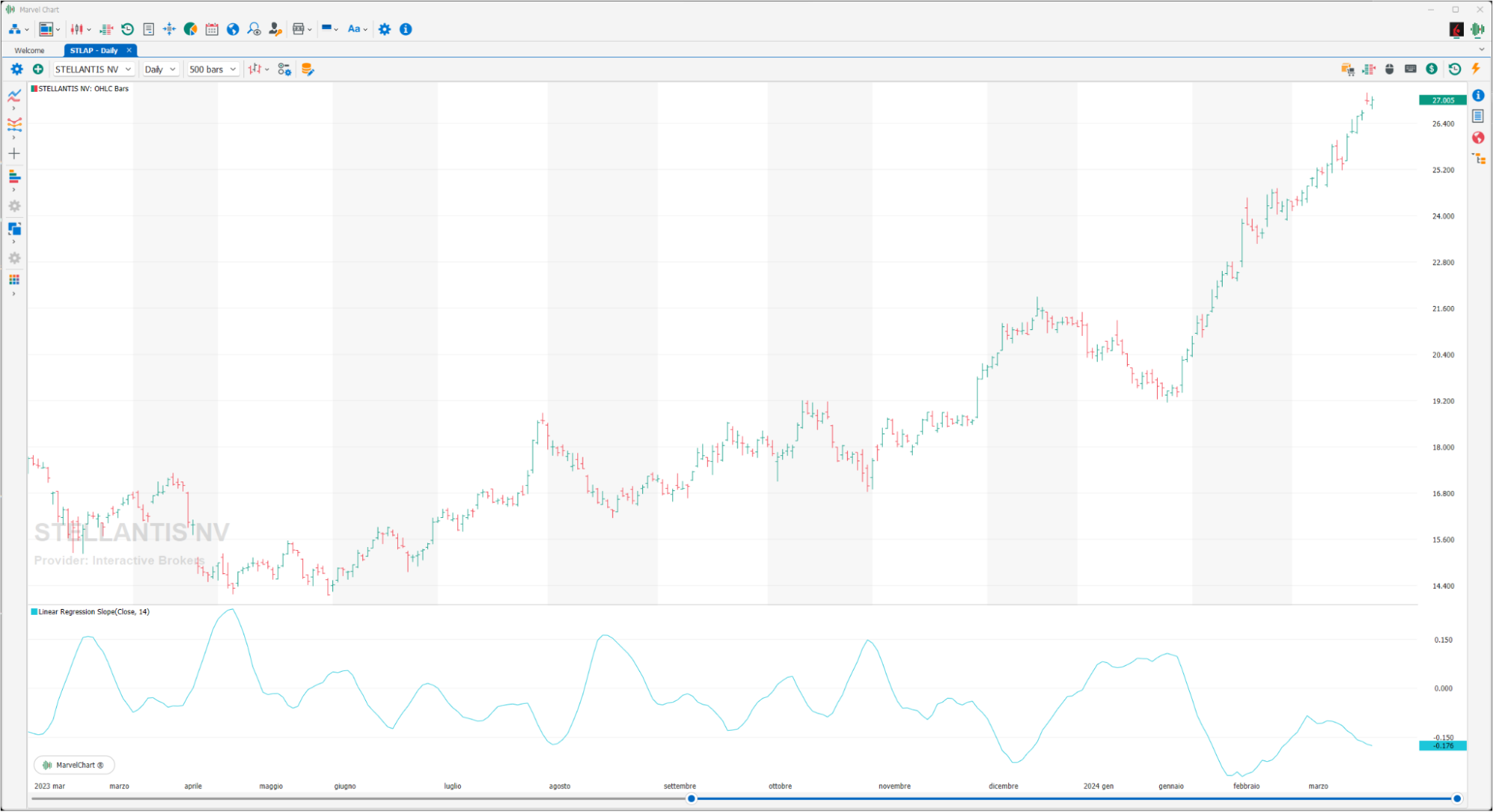
The Linear Regression Slope is an oscillator calculated using the linear regression technique. This technique is applied in technical analysis to determine whether the trend is bullish or bearish and with what intensity, considering past price fluctuations. As the name indicates, the slope of the linear regression, oscillates above and below the 0 line, is positive when the slope of the regression line (Slope) is greater than 0 and negative when it is less than 0. It can be used to measure the strength or weakness and direction of the trend.
Prime Number Oscillator
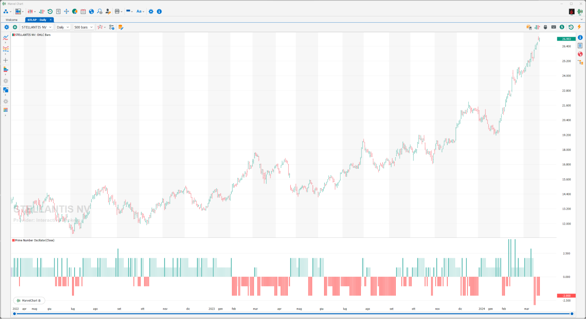
The Prime Number Oscillator is an indicator that is derived from the “Prime Number Bands” but displayed as an oscillator.
Rainbow Oscillator
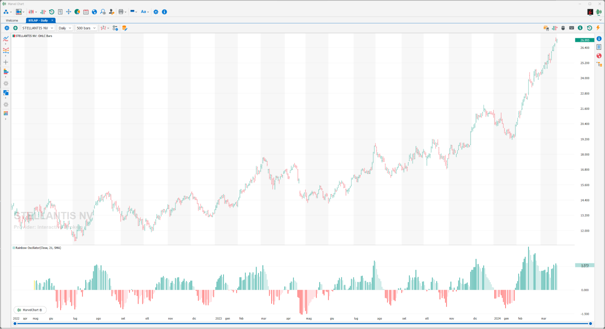
The Rainbow Oscillator indicator was created by Mel Widner in 1997. In essence, the indicator is calculated by averaging the difference between the price and the values of all “moving averages” with a period less than or equal to the value of the input Levels (it is recommended to display the Rainbow Oscillator as a histogram). The simple crossover indicates the potential change in trend; Rainbow Oscillator is a typical trend-following indicator and you will have to be careful, because in the lateral phases false signals will surely be generated. For this reason it can be more effective if used as a confirmation of price reductions from congested areas.
Random Walk Index
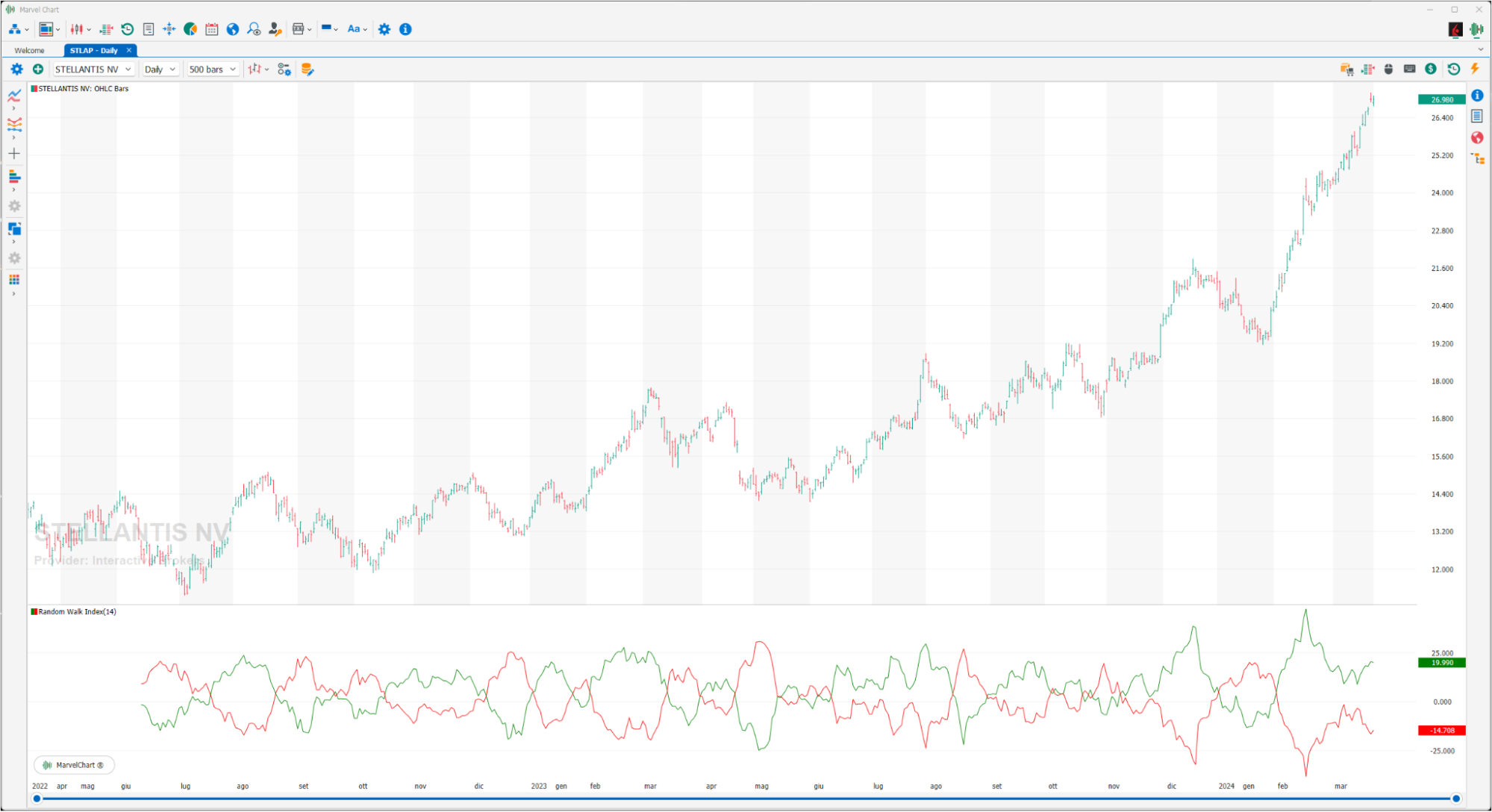
The Random Walk Index is an indicator that tries to determine whether the price movement of a financial instrument is random or the consequence of a statistically significant and therefore more reliable trend. The indicator is composed of two bands RWI High and RWI Low, the first identifies long trends, the second identifies short trends. The interpretation is very simple, the greater the width of the range between the two bands drawn, the greater the strength of the trend, long or short based on which of the two is above the 0 line.
R-Squared
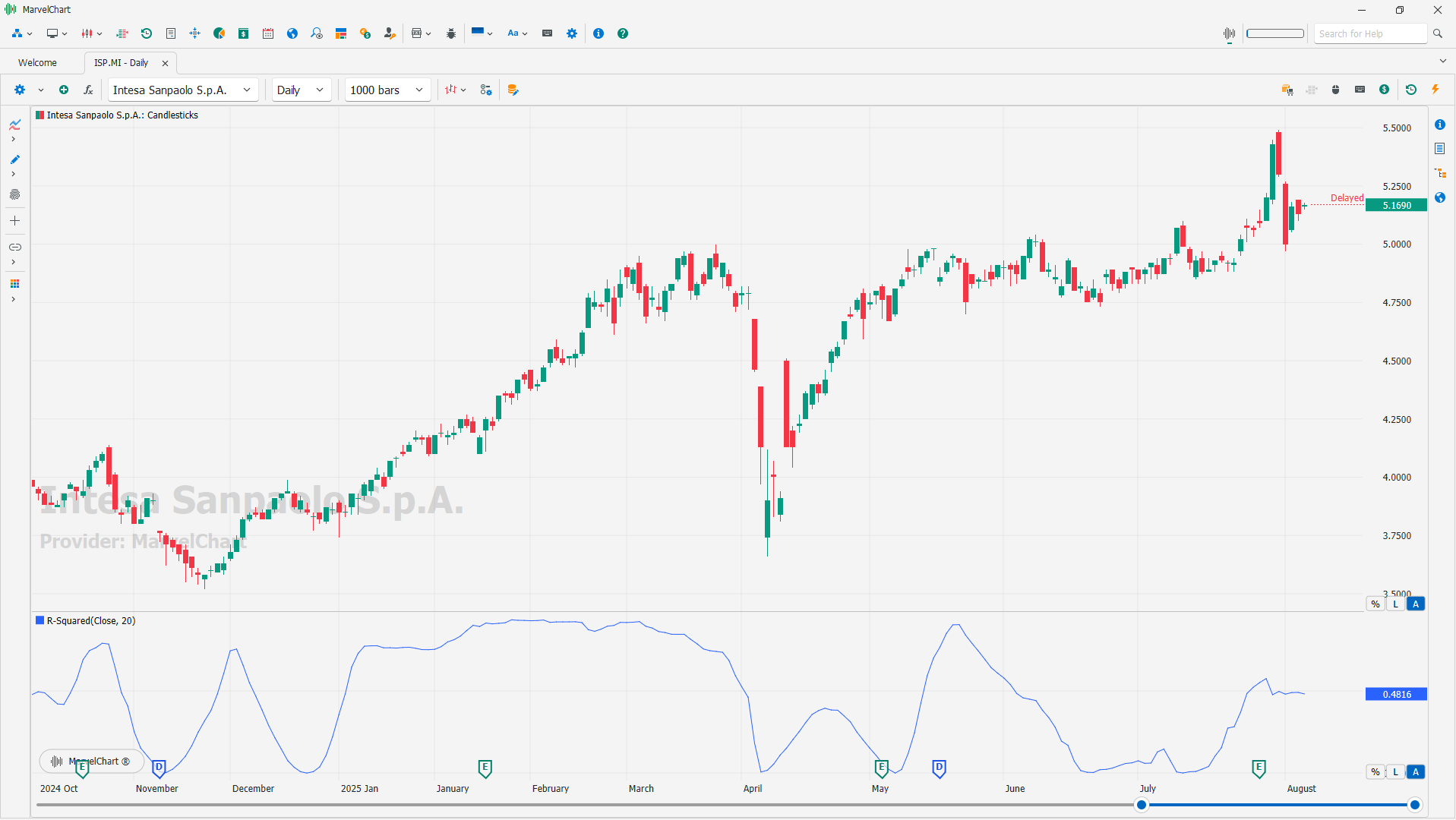
R-squared, also known as the coefficient of determination, is a statistical measure that represents the proportion of the variance in a dependent variable that is explained by an independent variable(s) in a regression model. In simpler terms, it indicates how well a model fits the data, with values ranging from 0 to 1. A higher R-squared value suggests a better fit, meaning the model explains a larger portion of the variability in the data.
Sine Wave
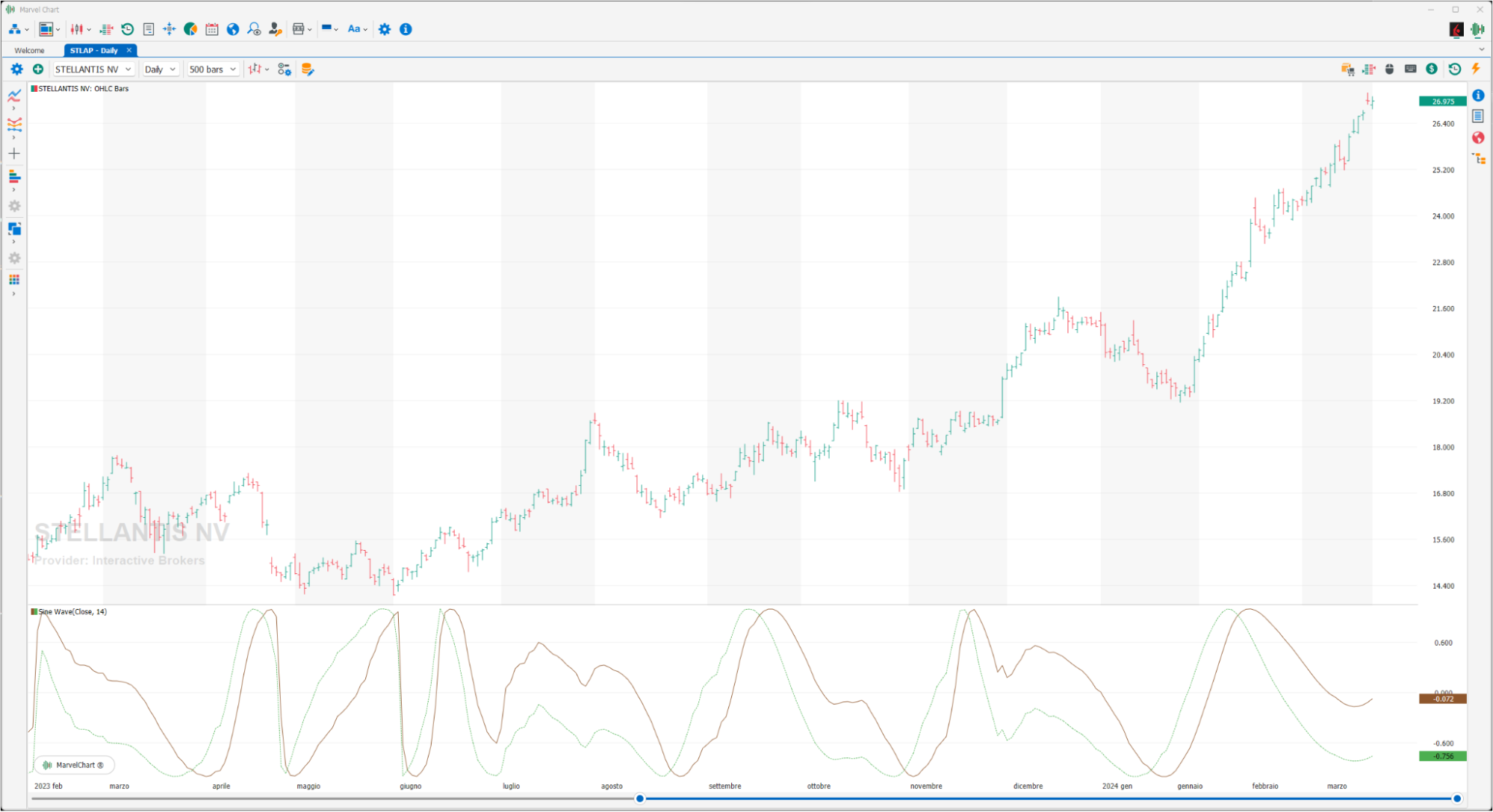
The Sine Wave is a recent indicator, created by John Ehlers in 1996 and used to highlight whether the stock is in a trend or in a cycle. The Sine Wave is composed of two graphs, the Sine Wave (green) and the Lead Sine (red), the first measures the phase, the second the phase increased by 45° degrees. Together the curves give indications on the state: in a defined trend or not in a trend. A BUY signal occurs when the Sine Wave (green) crosses the Lead Sine (red) at the top, a SELL signal when the Sine Wave (green) crosses the Lead Sine (red) at the bottom.
Standard Deviation
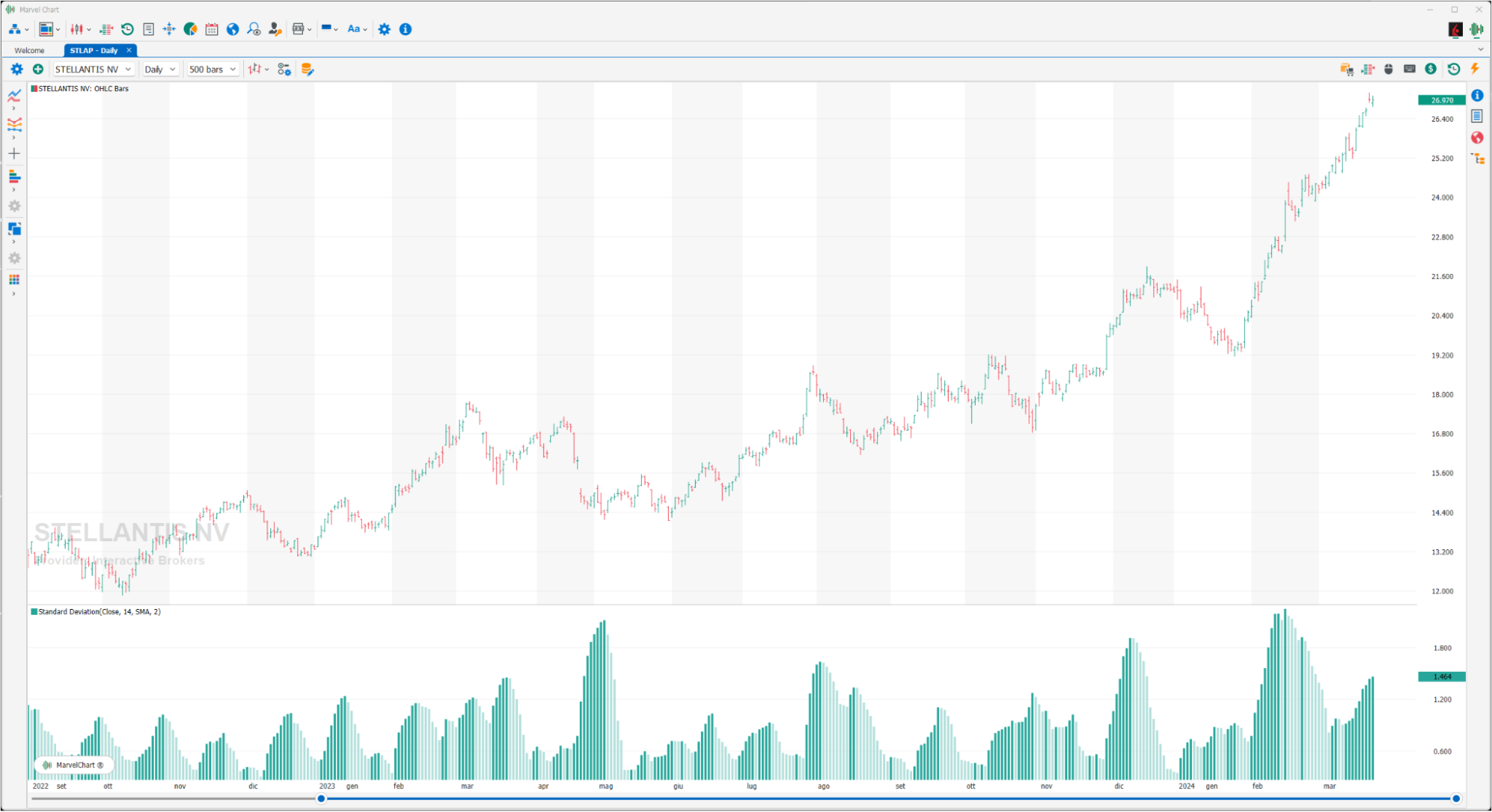
The standard deviation is an index that measures the volatility of prices, as the difference between average prices. It follows that the indicator will rise upwards when the difference between the current CLOSE price and the average CLOSE price is greater, and will fall in the opposite case. It can be used as a support to determine phases of euphoria or stability of the market: we will have peaks in the case of euphoria, while the values will be low in the presence of phases of laterality of the financial instrument being analyzed. Given the high number of information that often comes from other indicators, the Standard Deviation can be useful to have a general picture of the situation. The user can configure the indicator as he/she deems most appropriate, for example by applying it to OPEN prices, or by using other types of “Moving Averages”, or finally by changing the number of “Moving Averages” periods.
Standard Error
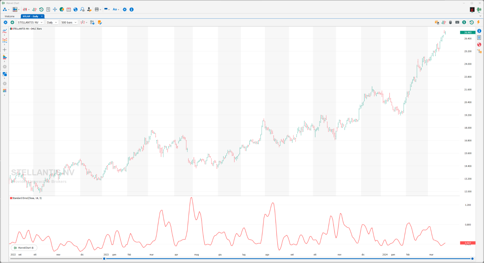
The Standard Error, for a specified period, measures how much the prices have deviated from a linear regression line for the same period. The higher the value, the more the prices have deviated from a linear regression line for the same period, while the lower the value, the closer the prices are to the linear regression line. If all the CLOSE prices were equal to the corresponding values of the linear regression line, the Standard Error would be zero.
Variance
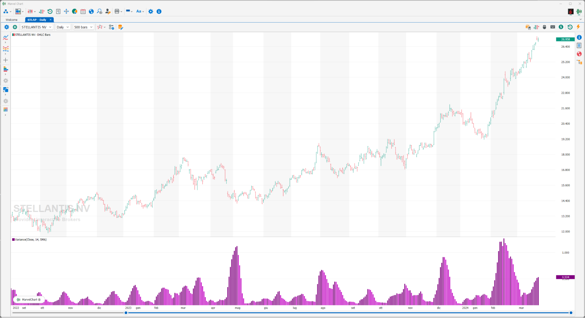
Given a series of values, it is the average of the squares of the deviations of the individual values from their arithmetic mean plotted in the histograms. For convenience, a color scale is assigned based on the price trend on which it is calculated.
Z-Score
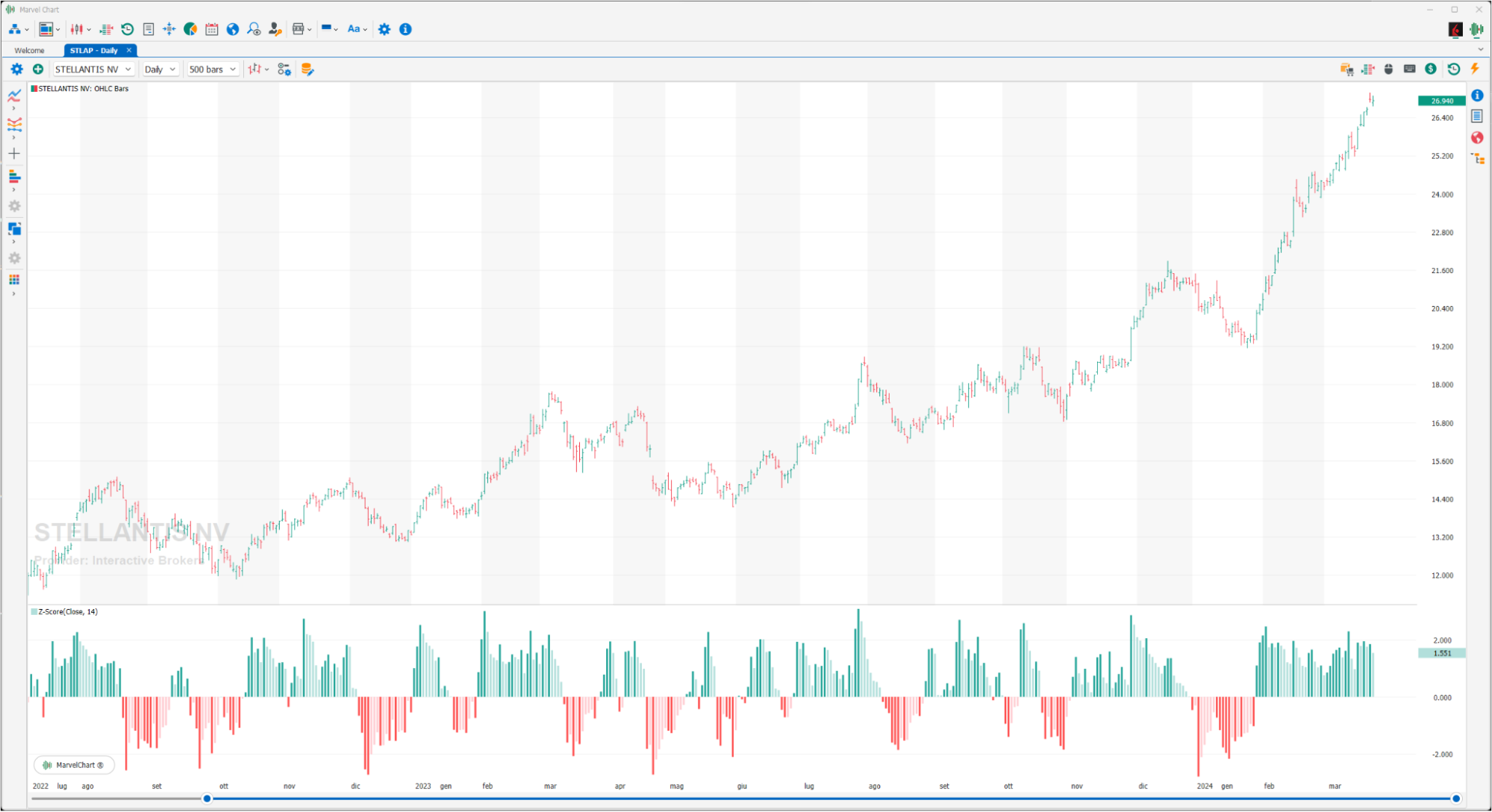
The Z-Score indicator can be used both on an asset chart and on a watchlist with a set of assets. The Z-Score represents the distance of a point in a data series from the mean of the same, expressed in number of standard deviations. Values greater than +2 indicate that there is a 95% probability that the values in the input vector will decrease. Values less than -2 indicate that there is a 95% chance that the values in the input vector will increase.